The Covers That Almost Were
Sketches, concepts, and behind-the-scenes notes on THE WITCH'S ASSISTANT🌙 cover.
A. T. Napoli
6/18/20257 min read
The Covers That Almost Were
Sketches, concepts, and behind-the-scenes notes on the The Witch's Assistant🌙 cover.


At the end of 2023, my publisher, Podium, asked for my thoughts on what the cover of The Witch’s Assistant🌙 should look like. I shared a few doodles and some very ~candid~ musings, along with reference art and my favorite covers, several of which are included below.
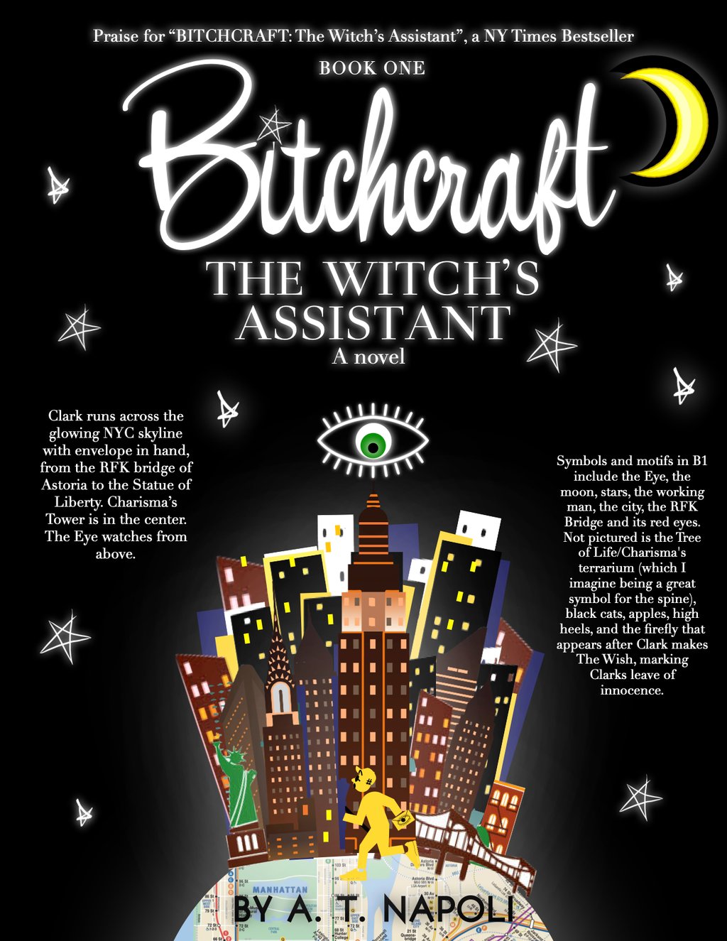
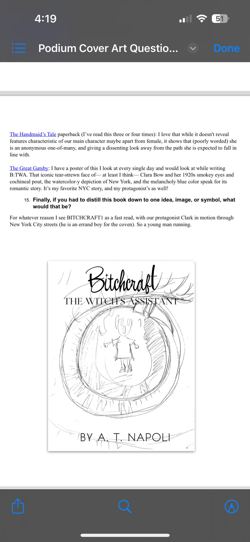
Throughout Book One, Clark never really stops running: he's always on the go in the same Chuck Taylors he's probably been repurchasing since high school. Even if he stands still, his mind keeps going.
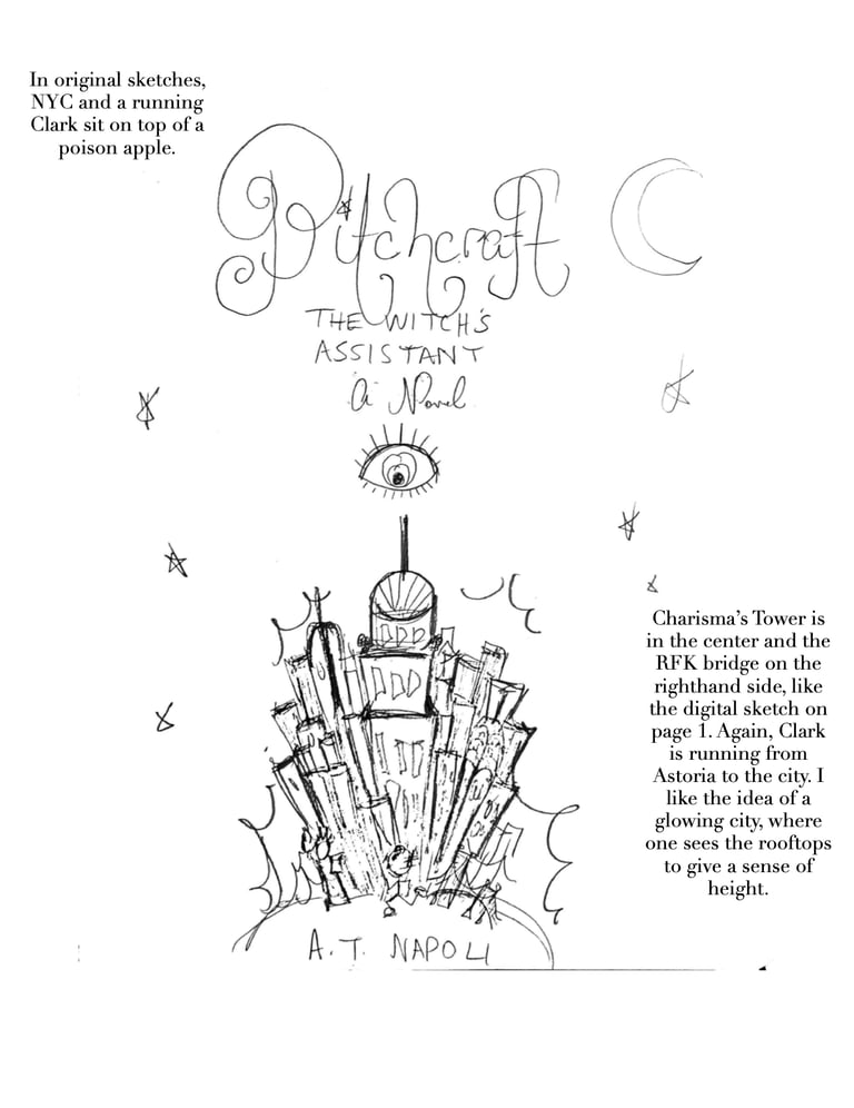
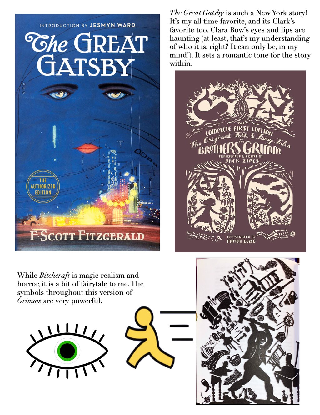
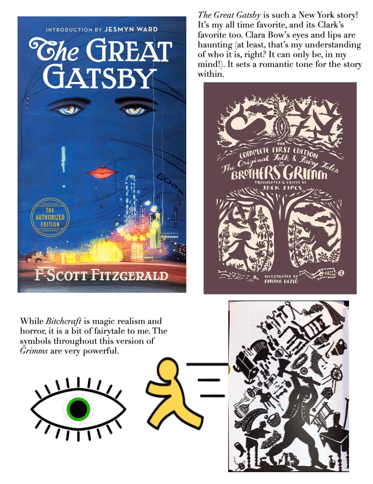
I doodled this running-cover idea quickly and reproduced it on Pages, noting that in the original drafts, Clark runs on a poison apple-globe (zoomed out)—all a bit busier than need be! But I loved the All-Seeing Eye looking down and the MTA map, running from Astoria to the Upper East Side. The stars are hand-drawn and used throughout this website. We love a twinkle.✨
And notice the flip in title treatments? The flowery B*TCHCRAFT🌙 sits on top, while "THE WITCH'S ASSISTANT" is bold and severe, the opposite of how it landed in the final?
I'm glad it went the way it did.
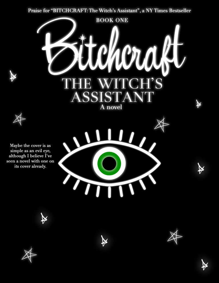
My covers didn't necessarily scream witches. And this cover should definitely scream witches.

Since the inception, however, I've had one other totally gratuitous, self-indulgent fantasy:
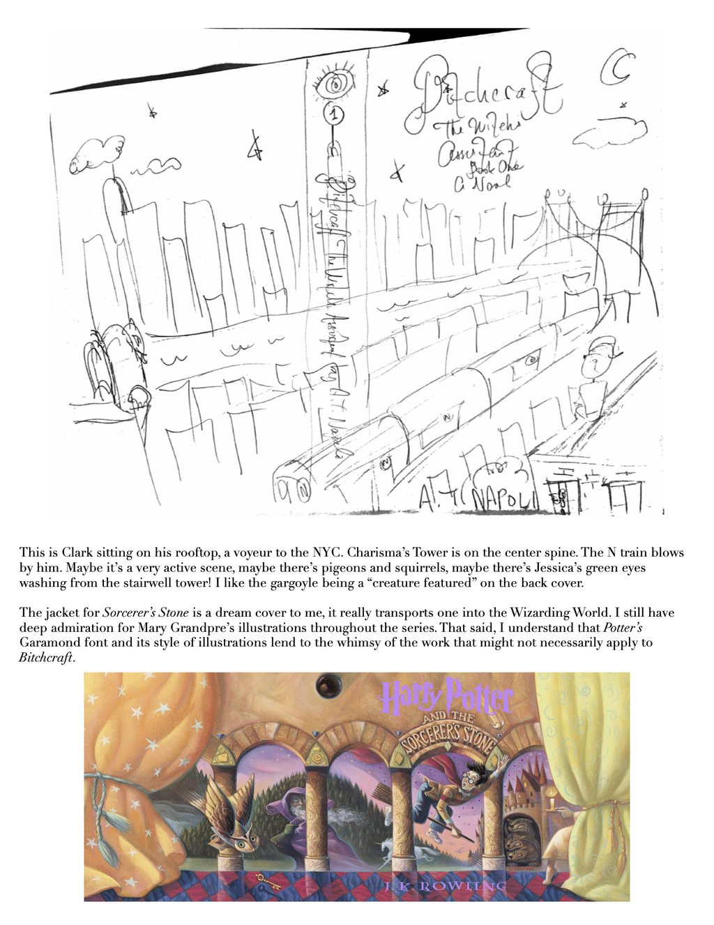
An oil pastel and acrylic fever dream of a cityscape à la Mary GrandPré for Harry Potter. I swear I still get teary-eyed if I stare at those covers for too long, they were my childhood. If my own book covers could invoke even half that love...
To me, if Clark is always on the go, this is what he fears will catch up to him if he ever stops: the despondent Astoria Blue of Chapter I. It's the launch point and the tonal contrast for everything that follows on his hero's journey.
He's perched on the roof ledge of his apartment building, the N train rattling by. Below: the storybook rooftops of Astoria. Ahead: the metal-and-glass silhouette of Manhattan, pierced by the ever-watchful red eyes of the RFK Bridge on the East River—the "Great Divider of the Haves and Have Nots." Charisma's tower lands on the spine like a lighthouse, all beneath a dreamy, end-of-summer twilight sky, and the All-Seeing Eye.
On the inside jacket, I'd hide the Cheshire-esque eyes of a curious black cat peering around the rooftop's stairwell tower. On the back, a stone gargoyle watching over a grey Manhattan. For the color palette, I’d pull from the mustard yellow of the N train—a nostalgic, retro nod to those yellow-lit windows of proletariat-brick Astoria— against blues and indigos, and—
Woowee! Talk about romantic.
Hey, maybe when the time comes, for the hardcover edition :).
Maybe I'll even commit to painting a full-size rendition and share it with you.
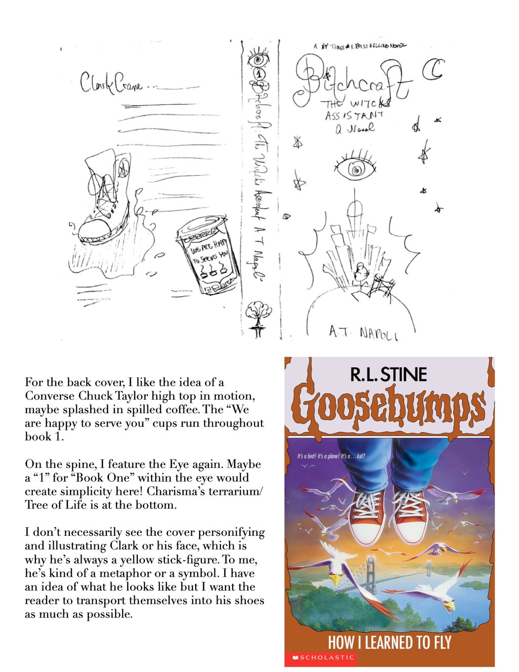

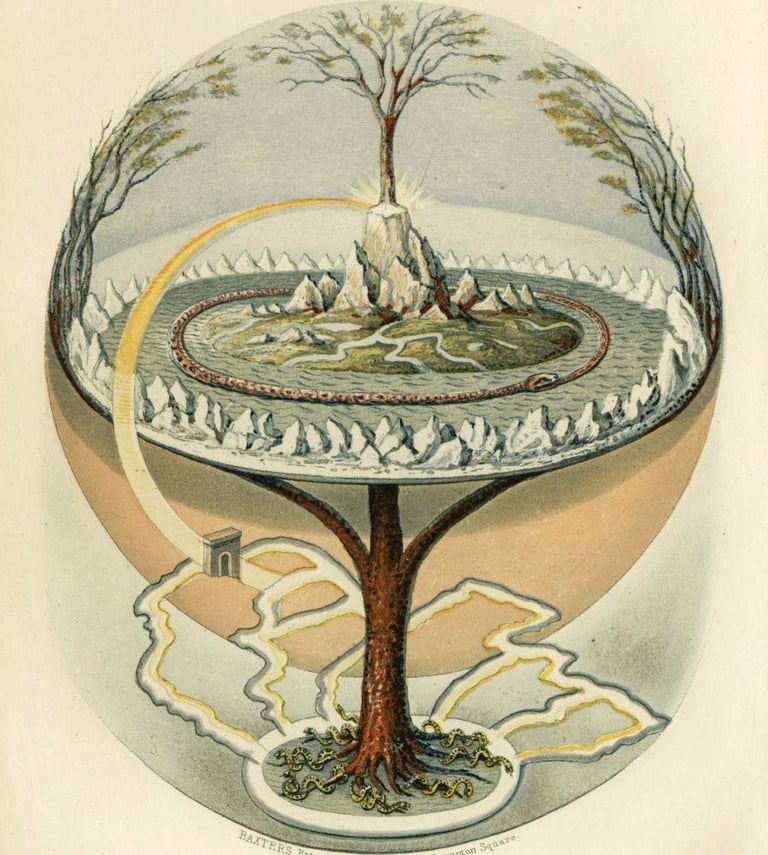
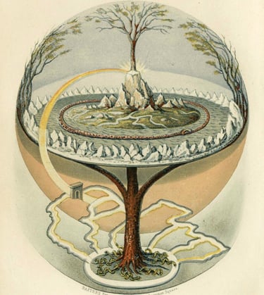
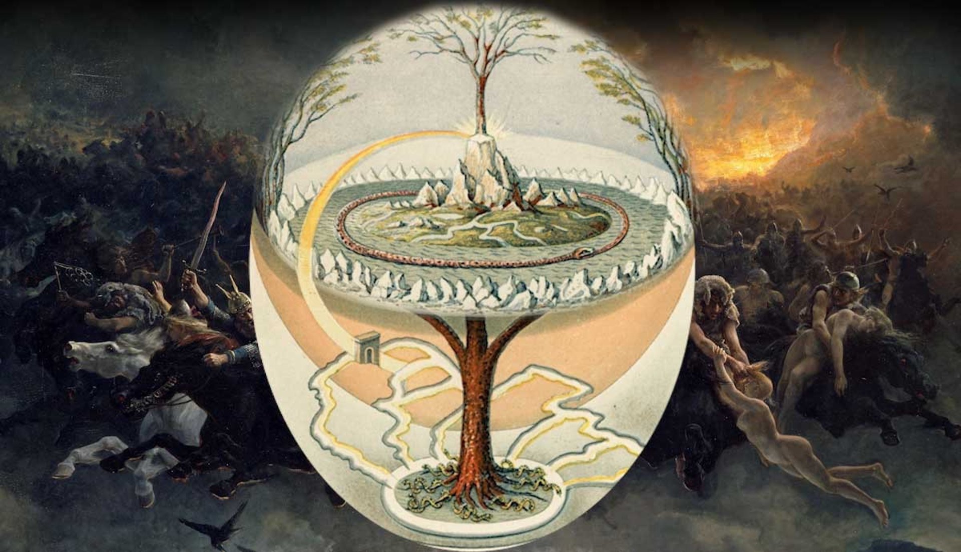
Along with the opening quote of Book One, I imagined the Tree of Life would make for another bigger visual symbol for the series. Perhaps it would've been printed on the spine under the Eye or otherwise tucked into the design—maybe a peak of it through an apartment window, on the back cover under the gargoyle. Charisma's glass terrarium is, of course, inspired by Norse depictions of Yggdrasil, pictured above.
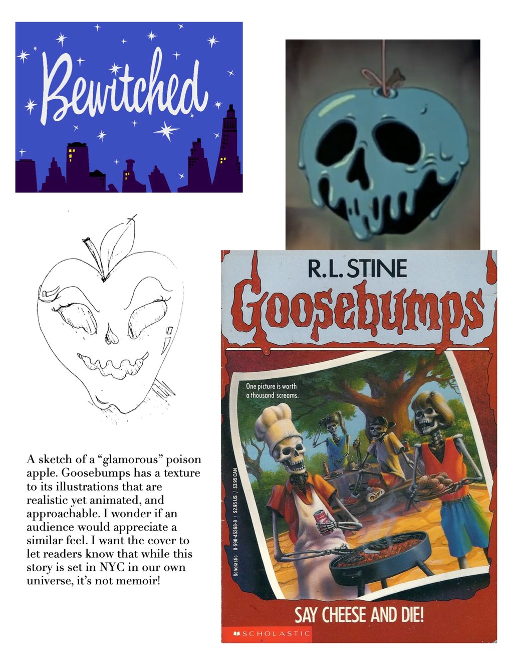
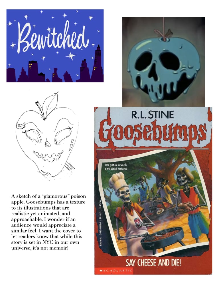
Other visual references include the covers for Goosebumps by illustrator Tim Jacobus, and a personal favorite copy of Grimm's Fairytales as they were originally told, one whose cover by Andrea Dezsö is etched into my memory: high-contrast papercut silhouettes of light vs. dark archetypes and symbols.
One back cover idea in the collage above shows Clark's Chuck Taylor Converse splashing through spilled milk and cawfee. A classic "We are happy to serve you" (ominous! spooky!) blue and white coffee cup — the kind Clark knows all too well from Astoria Coffee Shoppe and iconic amongst the Tristate's many bodegas and delis — deserves a special mention, too. Although I even mention in my notes how I don't necessarily require that Clark have a highly discernible face, now I wonder what my cover designer, Lisa Marie Pompilio, would've come up with.
The title screen for the 1960s sitcom, Bewitched, is a creative direction I'm very happy we followed after all. I think it'll resonate even more once you've read Book Two and dive deeper into Clark and Joey's upbringings, and their grandmothers.
Also included: The Great Gatsby by Francis Cugat always deserves a nod. It's one of the most iconic and beloved covers of all time, definitely mine and one of my favorite stories — so much so that I have a print hanging over my TV in my own Northern-facing Astoria studio. (I’ve always loved faces — I am a makeup artist, after all. My apartment is covered in them). The raining, tear-streeked cheeks, the soulful smokey eyes, and cochineal, Clara Bow pillow-box lips... It's a romantic portrait of New York City, but one hundred years after its publication—almost to the month—Gatsby still reads like a satire we haven’t outgrown. Clark learns the hard way that even his modern-day desires come with a sacrifice, in the pursuit of the American Dream. Gatsby learned that, too.
(LOL at my notes. Think less, Clark—I mean, Napoli!)
For my last idea, in thinking of scenes from the book and how this particular story would stand out in a market brimming with witches, I sketched a cover concept on a five-minute break: the burning witch as seen in the prologue, "The Tower," reflected in a single twinkly brown eye.
Originally, I imagined B*TCHCRAFT🌙 to be a YA series, occult horror even, but marketing it as a supernatural romantic comedy landed best. A cover of a witch getting fired 🔥 in the tower? Not so comedic!
Still, fun (or completely and utterly deranged) to think about the what if.
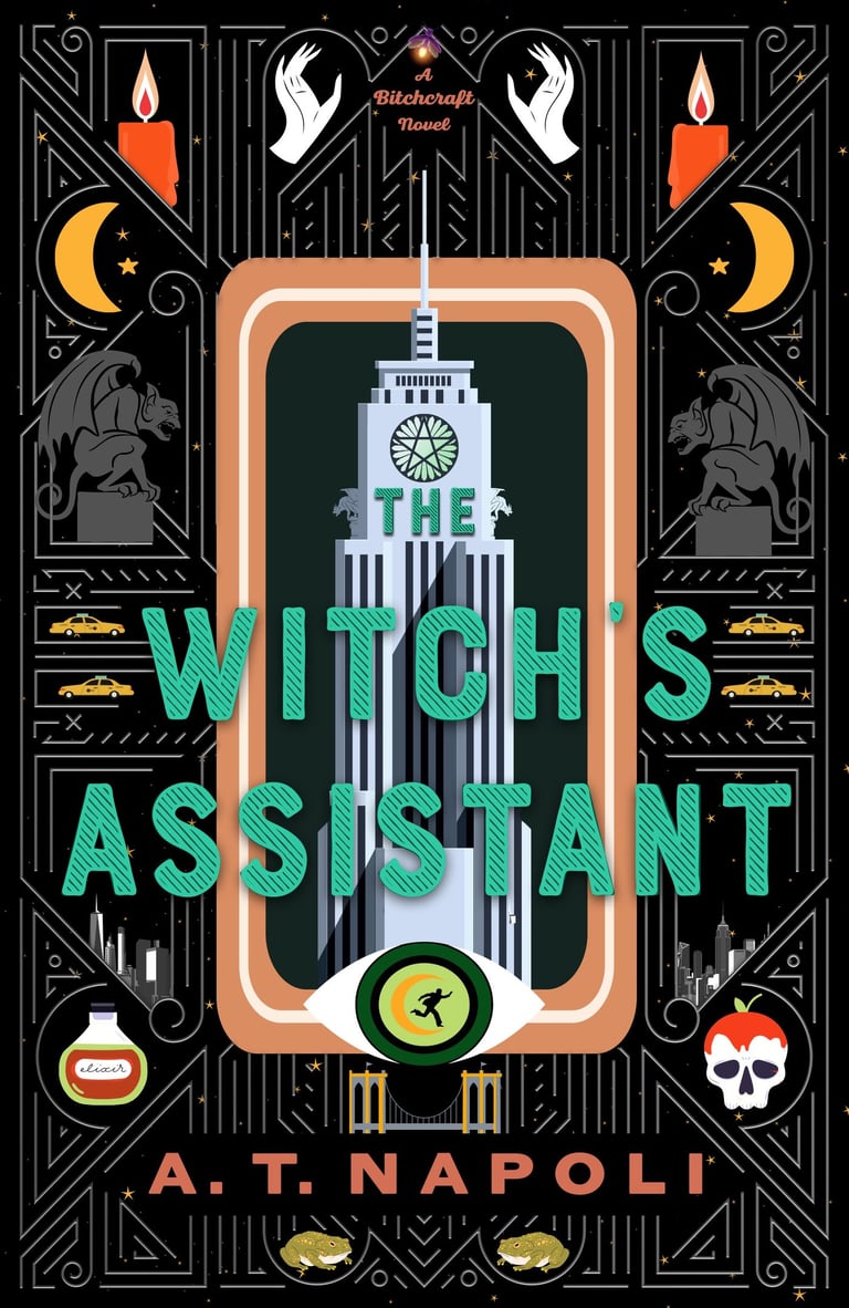
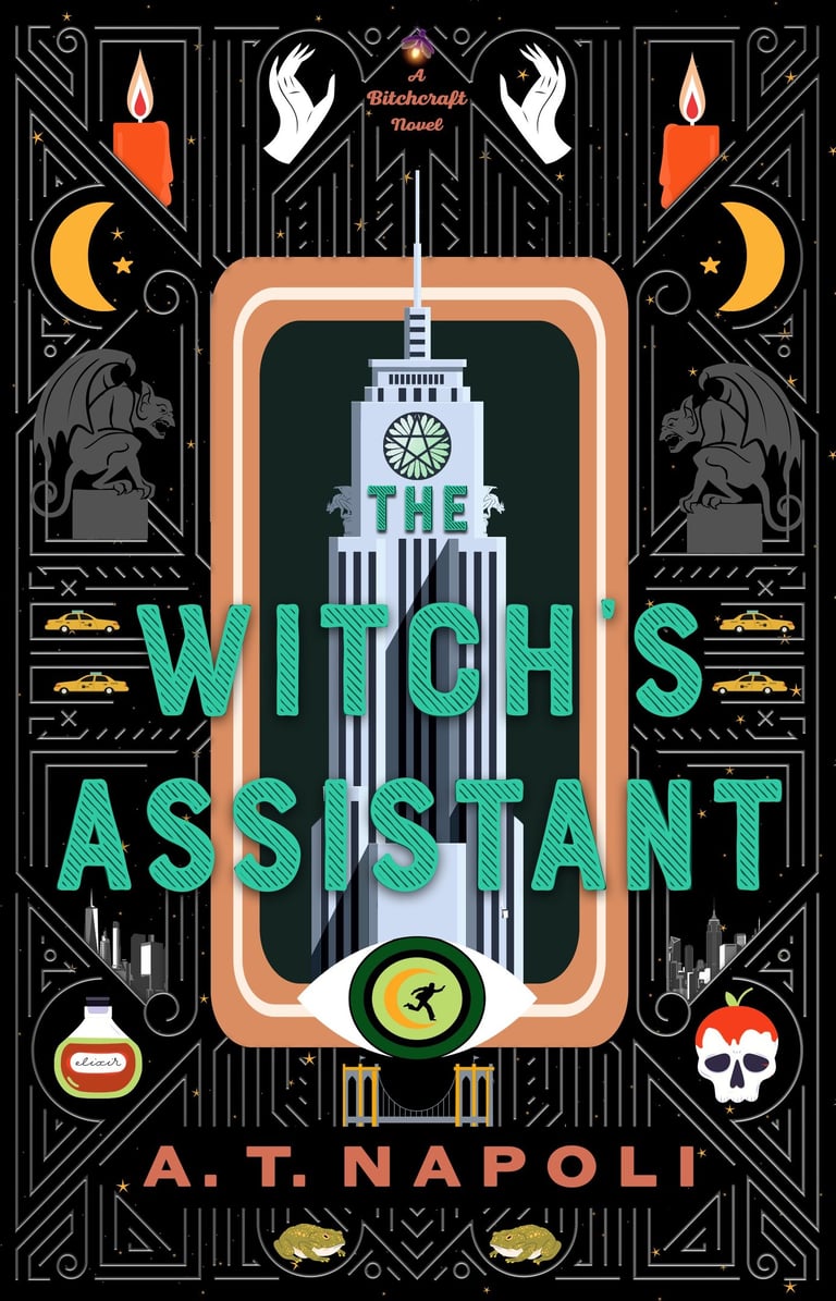
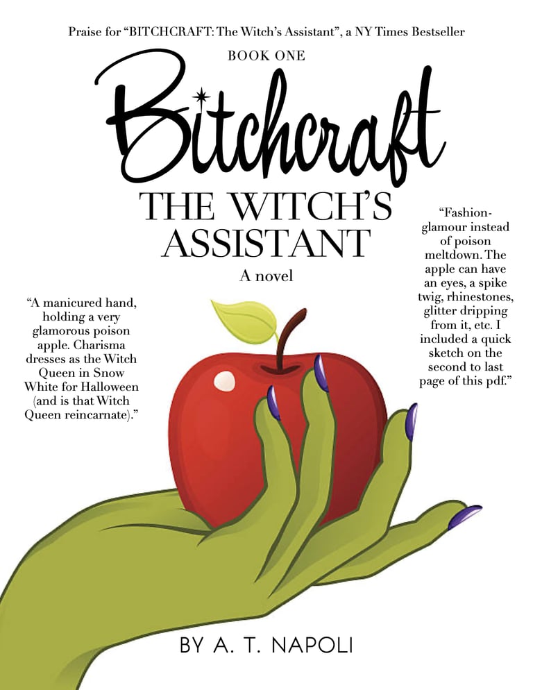
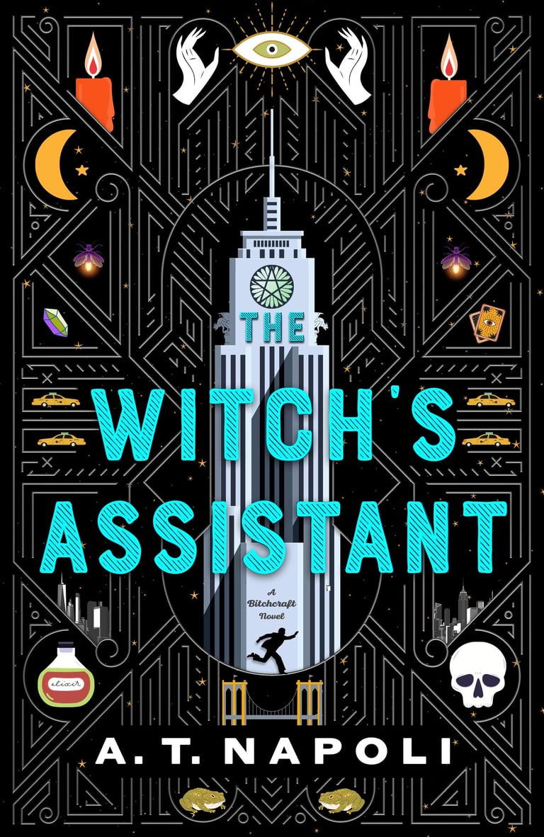
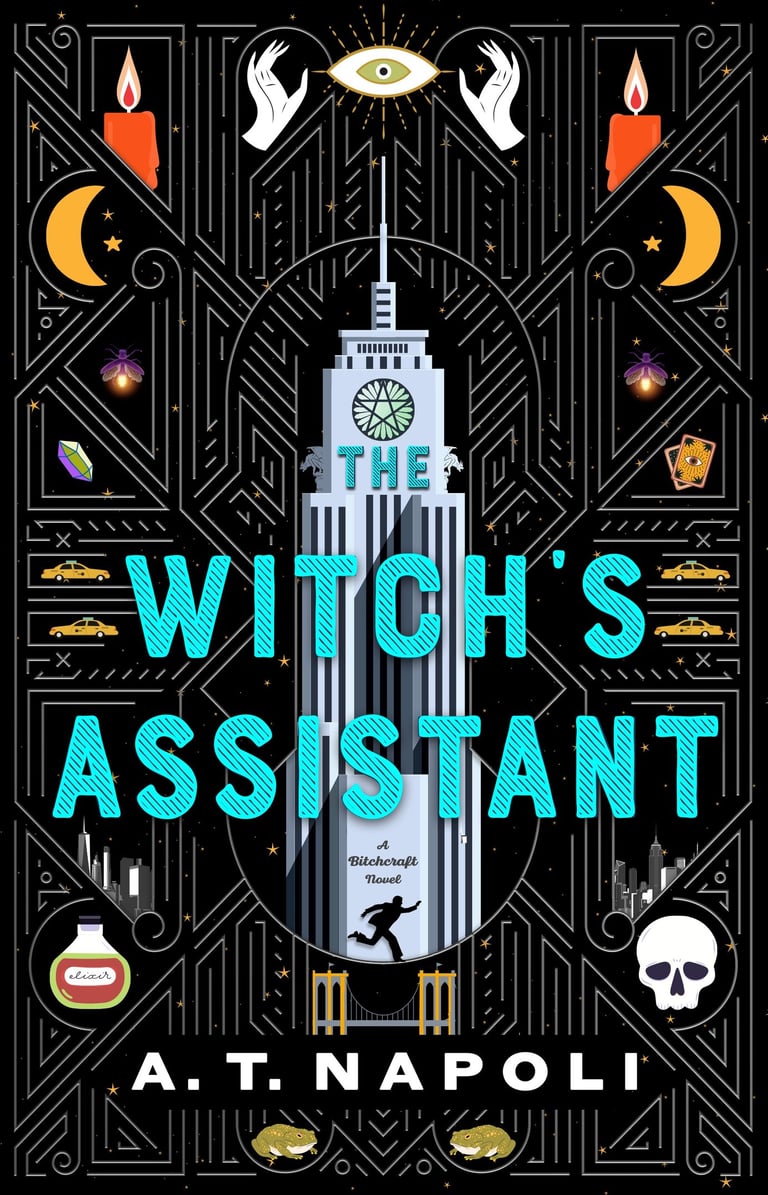
So Podium forwarded me these draft covers. The Art Deco angle? Wonderful (personally, I favored the third cover, but with the blue title font of the second cover). That potions bottle? Could have easily been swapped for a Charisma Eau de Parfum.
Ultimately, it was suggested not to use black as the background or tarot as a motif, since both were already in circulation within the market (black books being in surplus, allegedly). Still, I loved seeing these interpretations.
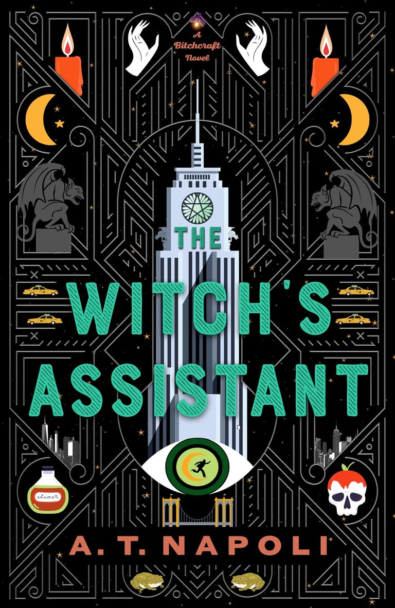
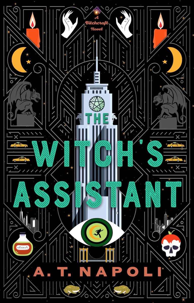
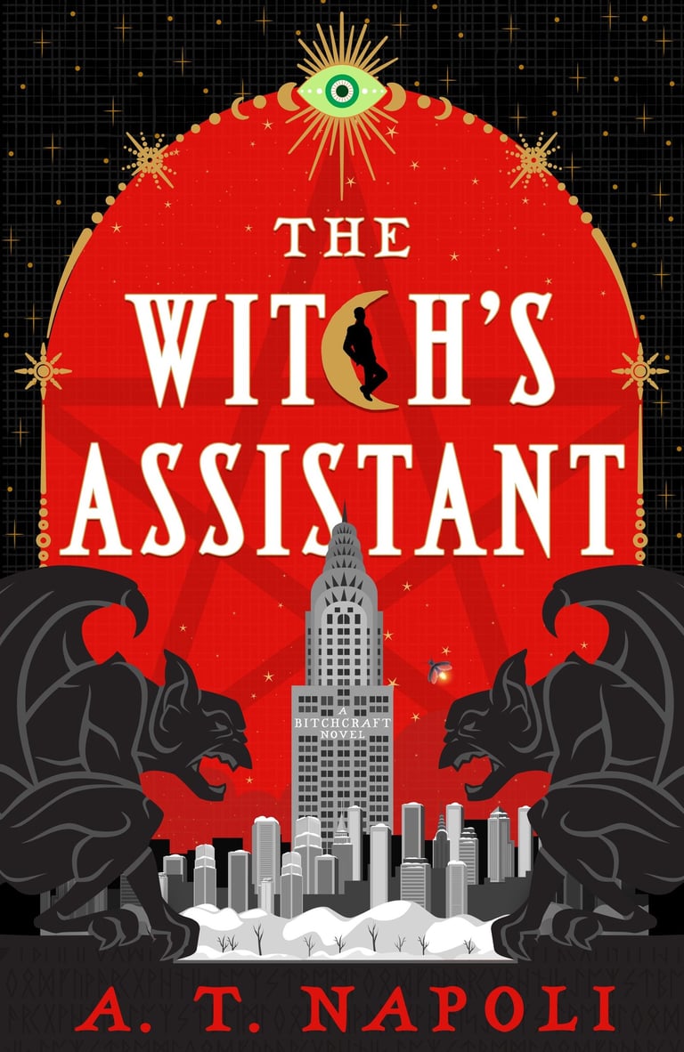
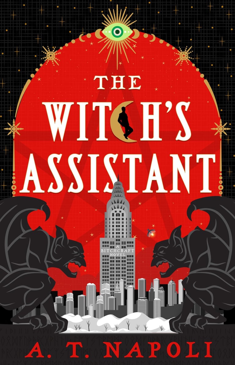
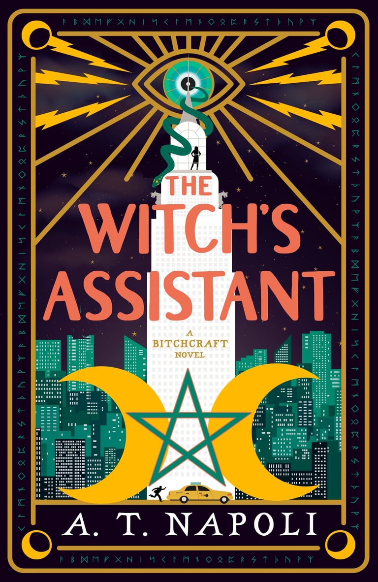


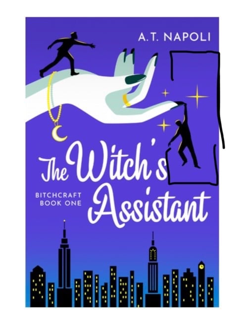

During the back and forth, the moon charm on the hand's bracelet was removed (I wish it had stayed! Or a pentagram instead, maybe?).
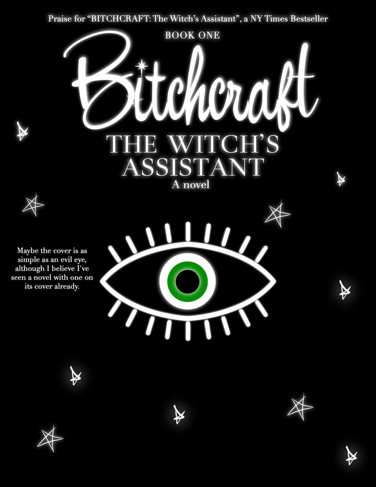
While troubleshooting spacing, I found myself referring back to it, saying a moon could fill some of the dead space on the right margin. I even dropped a moon emoji under the author title, the same one you use in text messages (you witch!) — and by that point, I'm sure the team had had enough of me!
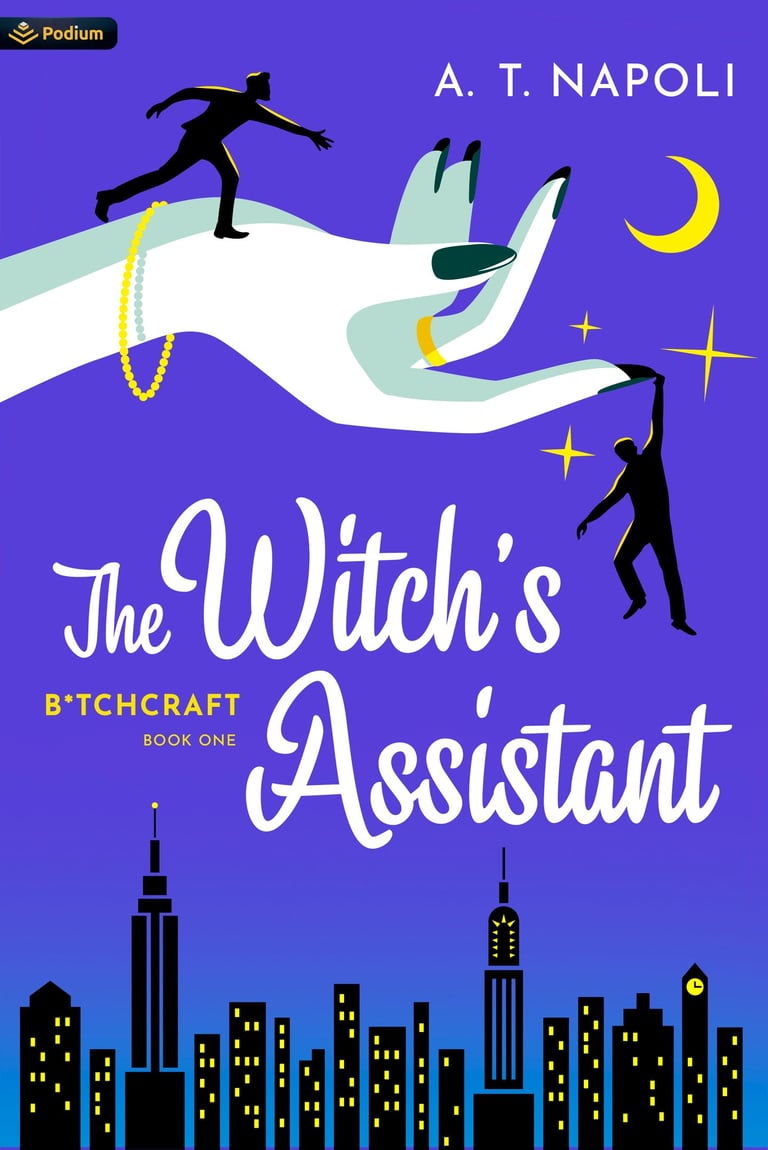
So that was the final that stuck!
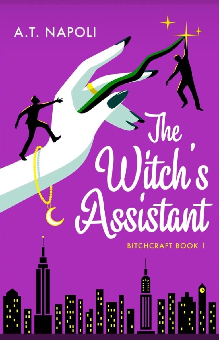
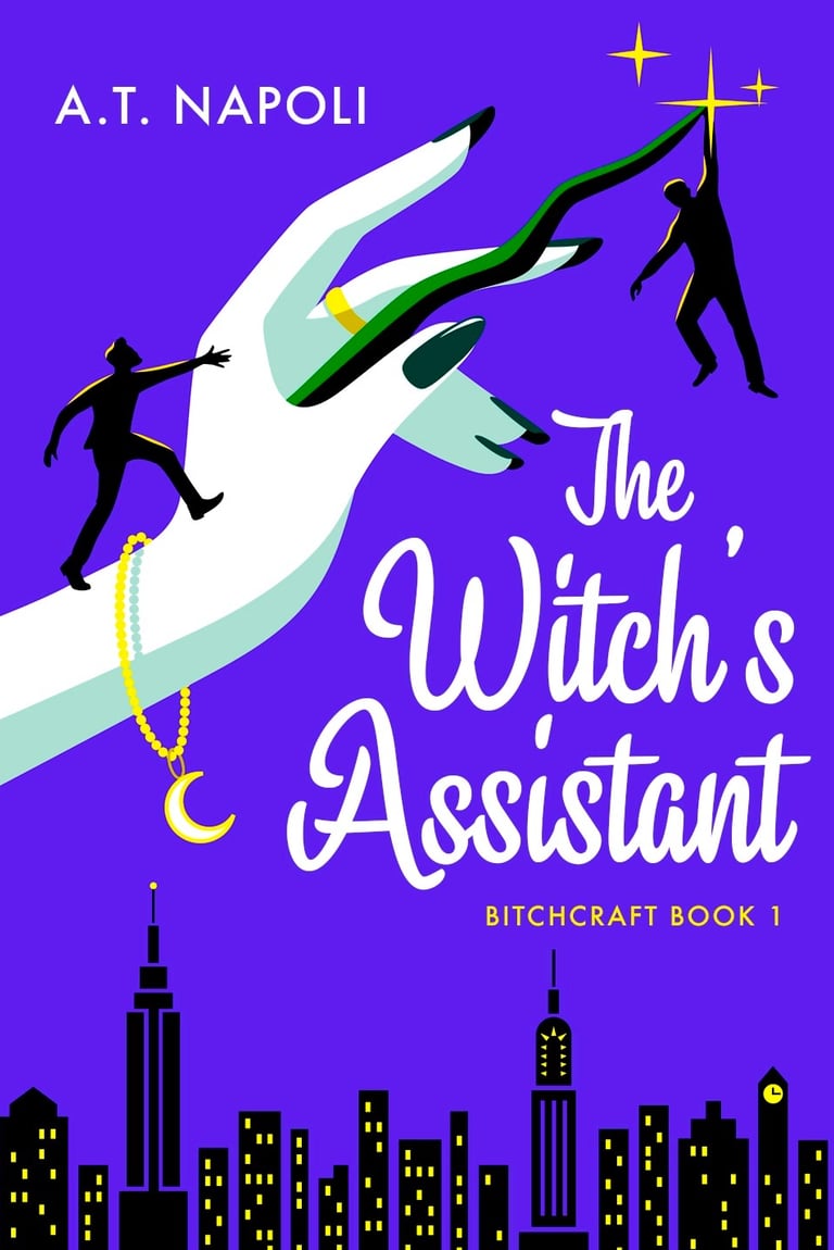
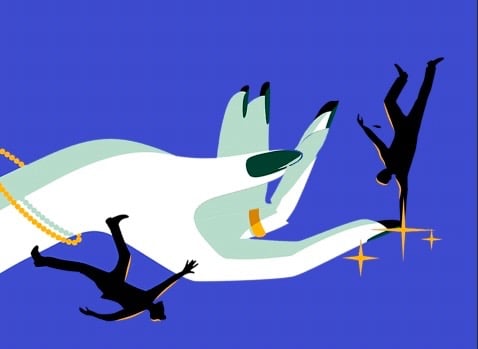
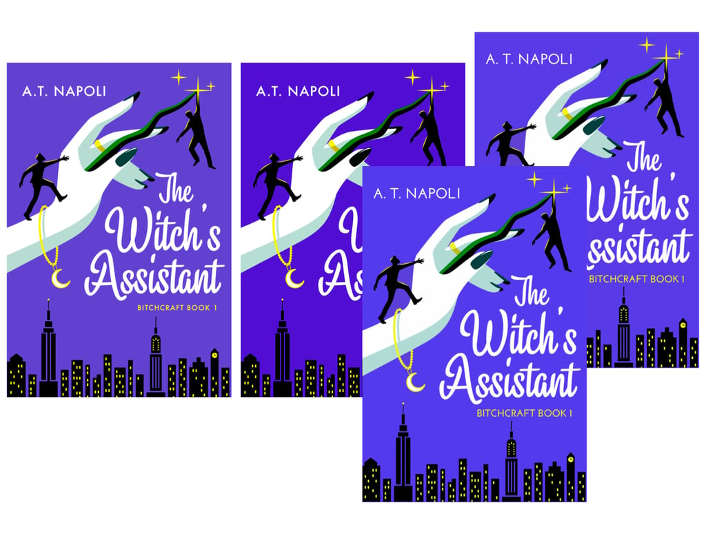
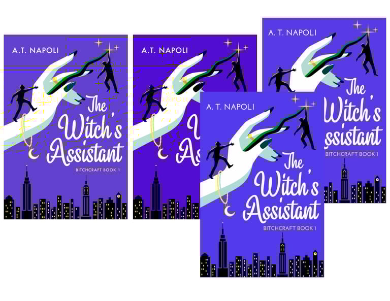
A month later, Podium sent me back these two stunning covers, both leaning on indigo! The manicured hand, the two men were perfect. I especially loved the slope of the wand and The Witch's Assistant🌙 title, it really carries the eye. I requested the sky be more periwinkle-blue like in the story, and was graciously obliged with a beautiful gradient.
The fuchsia concept would've made for a striking cover, too.

While the wand was beautiful, it stood out to me and a couple of my beta readers. Since wands aren't central to the story's magic system, I didn't want to potentially mislead readers about what kind of book they were investing in. I suggested a thunderbolt, but it didn't test well. I asked if the hand could be flipped over, for a more beguiling gesture.
I think the finished design hits a high note on shelf-appeal: a nostalgic feel, a sitcom cityscape with sparkle, a flowery font that reads just as beautifully on the spine. It's something old, something new. And having that emoji associated with the series? Turns out, it's made for great marketing. I hope that whenever you see that crescent moon, you think of B*TCHRAFT🌙.
Which direction would you have followed? I'd love to know what you'd imagine for future covers — drop your thoughts in the comments below!
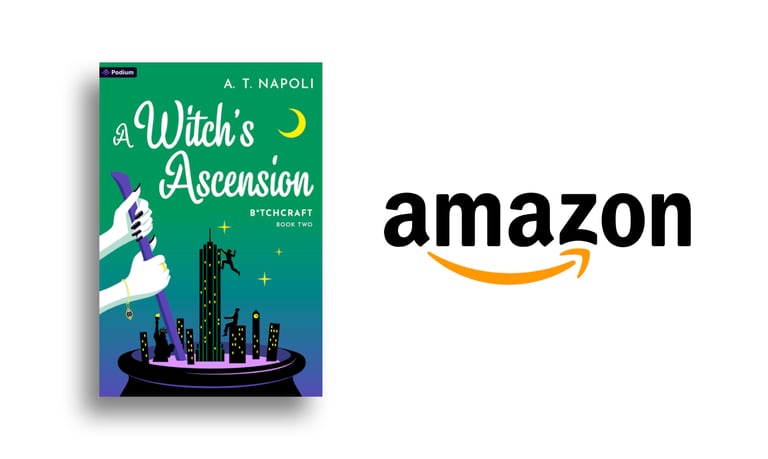
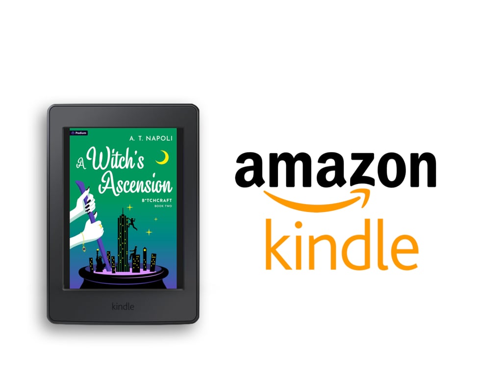
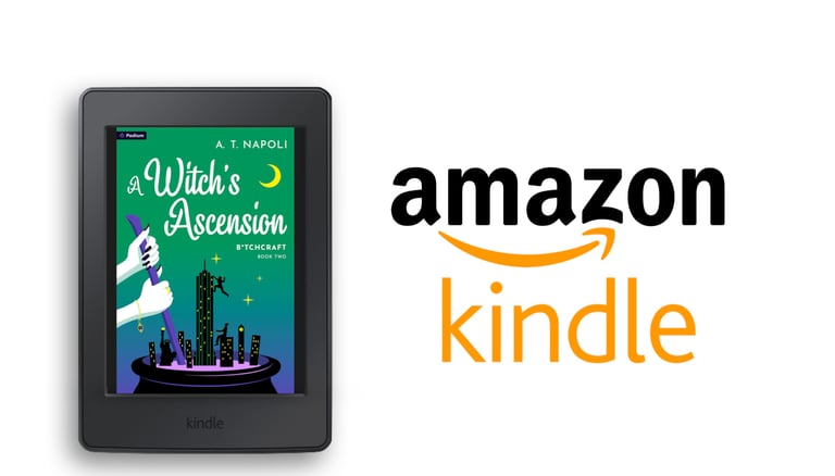
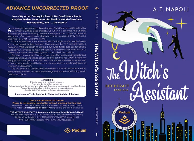
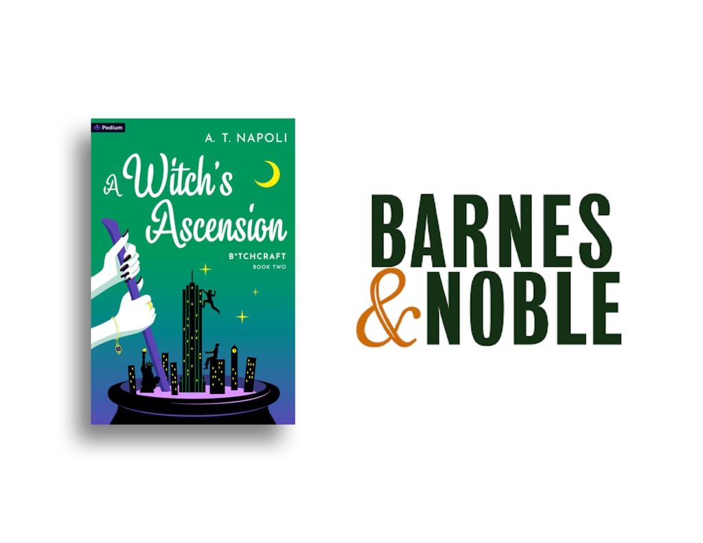
Preorder Now On:
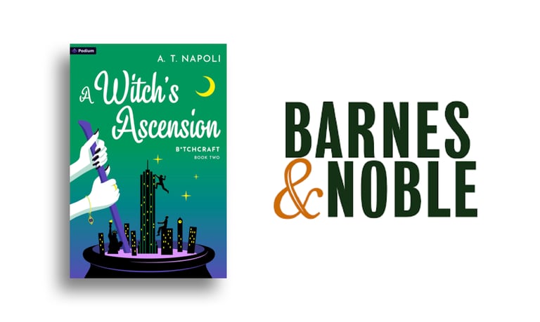
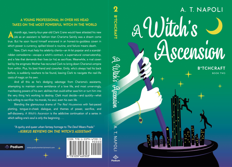
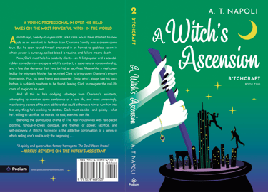
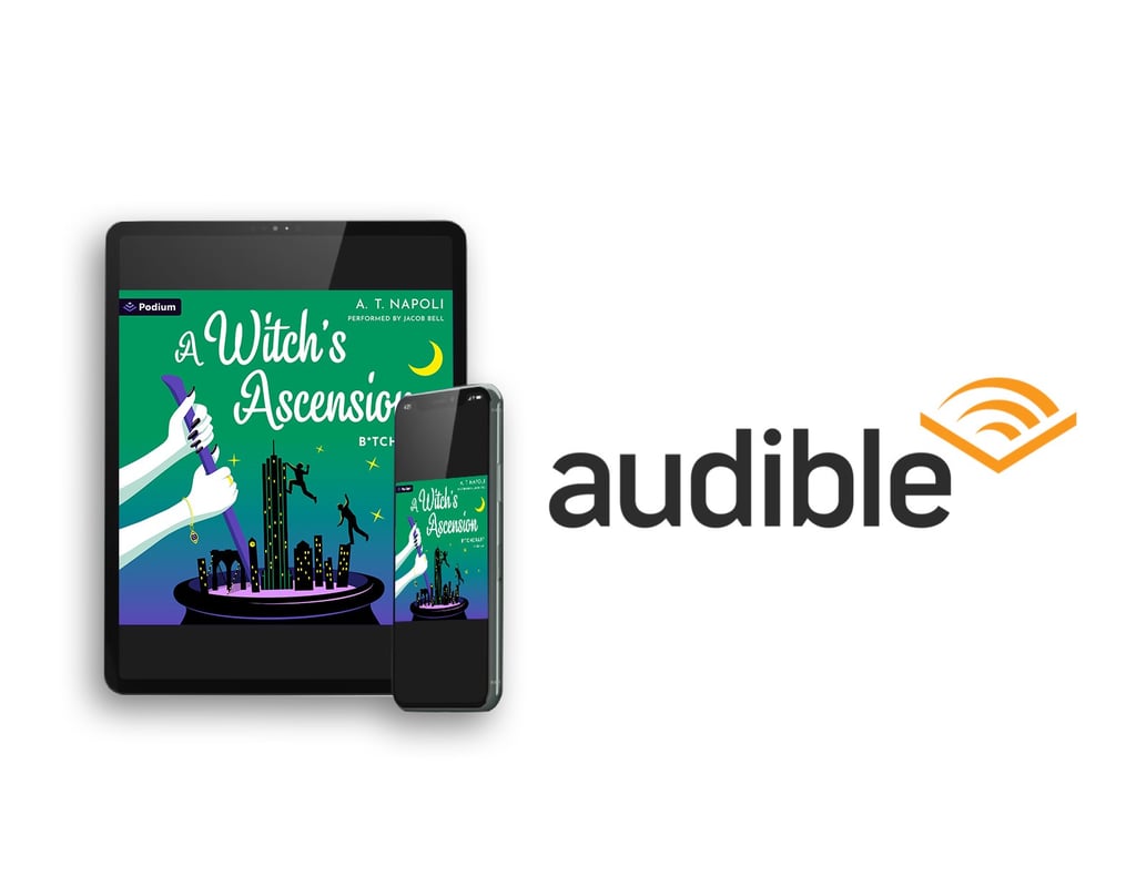
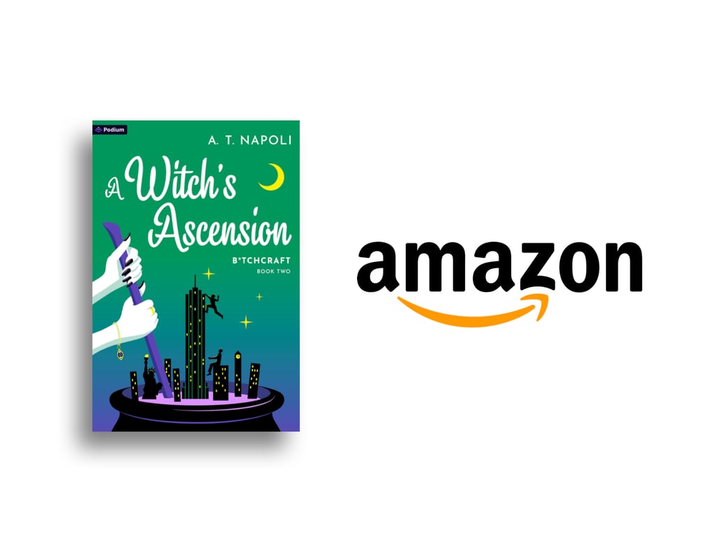
And check out the second cover, Book Two coming September 2nd, 2025, with Book Three's cover already on the way. What do you think?
Featured image of Yggadrasil by Susanna Andrews
CONTACT
© 2026 A. T. Napoli. All rights reserved. All spells final.
Join the mailing list for the latest updates and exclusive content on THE WITCH'S ASSISTANT and its sequels.
Don't Break the Circle...
There's no in
Btchcraftbooks@gmail.com


The Witch's Assistant
B*TCHCRAFT Book One 🌙
A quirky, queer DEVIL WEARS PRADA fantasy — KIRKUS REVIEWS